커넥터&터미널
몰렉스
JST
연호
한림
3M
무탈피
터미널
하네스
IDC커넥터
IDC커넥터
박스헤더
래치헤더
플랫케이블
RF커넥터
BNC커넥터
D-SUB
D-SUB
D-SUB후드
젠더
서큘라 커넥터
SCN 커넥터
SCK 커넥터
핀헤더&소켓
핀헤더
헤더소켓
IC
MOSFET&TR
SCR&TRIAC
레귤레이터
수정진동자
스위치
메탈스위치
토글스위치
라커스위치
푸쉬스위치
로터리스위치
딥스위치
온도스위치
마이크로 스위치
슬라이드 스위치
택 스위치
PCB
페놀 기판
에폭시 기판
브레드보드
PCB서포트
다이오드
범용 다이오드
제너 다이오드
브릿지 다이오드
캐패시터
전해콘덴서
세라믹 캐패시터
마일러 캐패시터
칩세라믹 캐패시터
바리스타
저항
볼륨&노브
막대저항
트리머저항
시멘트저항
칩저항
방열판
방열판
배터리
배터리
배터리홀더
터미널블럭
고정식터미널블럭
조립식터미널블럭
릴레이
POWER릴레이
PCB릴레이
팬
팬
팬 지지대
파워
SMPS
어뎁터
노이즈필터
펠라이트 코어
휴즈
유리관휴즈
세라믹휴즈
다이젯휴즈
케이블
UL선
KIV선
조작선
점퍼선
케이블그랜드
멀티탭
랜케이블
USB케이블
HDMI케이블
DVI케이블
RGB케이블
AUX케이블
충전케이블
파워케이블
컨버터케이블
케이블정리
수축튜브
단자
압착단자
REC단자
펜홀단자
총알단자
바나나단자
악어클립&테스터핀
DC플러그&잭
USB단자
RJ45플러그&잭
인렛
스피커터미널
HDMI단자
부저
충전단자
젠더&기타
공구&기타
공구
납
기타
LED
일반LED
고휘도LED
KEM LED
칩 LED
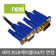
New
[NEXI] 넥시 RGB 연장 케이블
RGB 연장 케이블
2,100
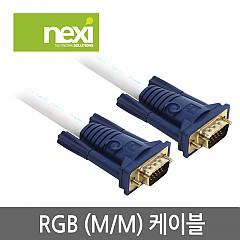
New
[NEXI] 넥시 RGB 모니터 케이블
RGB 모니터 케이블
2,780
1


